Logo
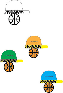
For my Logo Project I decided to incorporate all of the things that describe who my character is in one image. I choose three key things that I love including a basketball, a hat, and Tampa Bay because that is where I am from and makes me who I am today. I have always been an athlete who loves to compete in everything I do. I enjoyed this assignment and playing around with all of the different tools on the software. The hardest part for me in this assignment was making the arcs in the basketball, but I think it turned out okay. Making this was one of my favorite assignments we have had thus far in the semester.
Dear Jared,
ReplyDeleteThis design is super cool and I like the idea with the hat on top of the basketball it was a good way to put both the separate designs together. I also like all the different colors you used and the zig zag design you used to add something more to it, good job
jared, I like how your logo ended up. I enjoy how you made it like the basketball is wearing the hat and incorporated where you are from. overall good job
ReplyDeleteJared, your logo is so fun and has so much personality. I love that you incorporated the things you love to express yourself. I think in the future if you changed the color of the basketball for some it would add a lot to the logo. Great job!
ReplyDeleteJared, I like all of the color variations that you chose for your logos. It is cool that it is a hat onto of the ball, and that it also kind of looks like the basketball hoop. The zig zags make it unique as well.
ReplyDeleteThis logo is really cool. I love how you incorporated your favorite interests into one cool design. It could be a little bit neater and the colors could pop a little bit more. The hat that says "Tampa Bay" is also a really neat touch.
ReplyDeleteHi Jared,
ReplyDeleteYour logos turned out to be really cool! I like how you incorporated something that you love, and thought represents yourself. The creation of the basketball is pretty good, as well as the hats on top. Also good color combinations. Nice!
This logo looks really nice. I like how you were able to combine both the hat and the basketball into one design!
ReplyDelete