Posts

Blog and Participation

 My comments: https://jacobbackall.blogspot.com/2021/12/business-cards.html?showComment=1639475961840#c2570498847672488561 https://kevalynboettner.blogspot.com/2021/11/autoscopy.html?showComment=1639476278668#c7116888414511413027 https://gustavocabrerfmx210.blogspot.com/2021/11/autoscopy.html?showComment=1639476395619#c6108606245779779055 https://kayladailey.blogspot.com/2021/11/logo.html?showComment=1639476528623#c6533510231558433051 https://tylerdequarto.blogspot.com/2021/12/autoscopy.html?showComment=1639476751913#c6114869710685128754 https://sinclaireinfusino.blogspot.com/2021/11/tag-brush.html?showComment=1639476885185#c2995337419294194928 https://anyakaplanfmx101-11.blogspot.com/2021/11/autoscopy.html?showComment=1639477119256#c9018611642879027502 https://cassiescollegelife.blogspot.com/2021/10/vectors-propoganda-poster.html?showComment=1639477210227#c2705065478334779815 https://meaganlaudenslager.blogspot.com/2021/12/business-cards.html?showComment=1639477310779#c266996198619792

InDesign HW 1

 https://www.youtube.com/watch?v=0eqhUFRlvgI This was the first video I looked at when starting with InDesign. It is a beginner video that teaches the basics and how to use the selection tool. It was a short video that played around with all the different tools. I think this video was helpful because it gives you a clear idea of how to engage with the software at a basic level. https://www.youtube.com/watch?v=7VpAisbfldI This video showed the text tool and how you can create a text box into your project. Their is different colors, fonts, and gradients you can use to add effect! This is something that is very fun to play around with and it can really add life to your project. Pretty cool stuff! https://www.youtube.com/watch?v=z8iHu4ruXn8 This video was a little bit more complex and has to do with removing backgrounds from photos. You have to use the pen tool and the clipping path tool in order to add/remove a background. I thought this was a very interesting video because you can make s

Final Project

Image
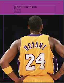
Artist Statement: This is my final portfolio for FMX 210 with Professor Roundtree. This class was very challenging yet very rewarding. After reviewing all the work I have done throughout the semester, it is a lot more than I thought. With all the struggle, I can say that I have learned a lot in this class and am glad that I enrolled in it this semester. My favorite project was doing the somewhere assignment because it was fun photoshopping myself next to a celebrity. I also really enjoyed making the business cards because I think that will be extremely helpful for me in the future. Thank you so much Professor Roundtree for a great class and a great ending to my collegiate career.   

Business Cards

Image
 Final Image: At first I was really nervous about making this but after watching one 20 minute youtube video on InDesign it started to come together for me. This is something that is very useful information to know because one day I plan on making my own business cards. The hardest part for me was trying to figure out how to change the brush so I could incorporate my tag brush. Other than that I think they turned out pretty decent.

Autoscopy

Image
 Final Image: I had really fun with this project once I finally got started. Just like everything else in this class it was very time consuming and required a lot of time on youtube watching videos. But I am pleased with how it came out. The idea is me placed in the woods at nighttime and I am supposed to be a wolf with an evil eye. It took me over 5 hours in all to complete this, but I learned a lot, especially with using different layers. Overall, I think I did a pretty good job.   Other Images:  

Calligram

Image
 Final Image:  This is my Calligram Project. I did this a while back and forgot exactly what I did, however it didn't turn out as I had hoped. With that, this is what I got from that project. It is supposed to represent a stop sign with a hexagon shape that I used red font to symbolize. The left side turned out as I wanted, but the entire right side looks off and jaggedy. Hopefully, I can learn how to make it better in the future.

Somewhere

Image
 Final Image: This makes me laugh every time I look at it, haha. It is a picture of me and my idol, Margot Robbie. I had fun playing with this one on Photoshop, and although it could've been better, I am content with how it came out. Next time I do something like this I will definitely do a better job cropping out the edges.